
The 3 Worst Logo Rebrands of All Time

In the world of branding, a logo is more than just a symbol; it's a representation of identity, values, and legacy.
While some logo redesigns successfully modernize a brand's image, others fall flat, leaving customers scratching their heads and companies counting the cost.
Let's take a closer look at three of the most infamous logo rebrands in history.
1. Mastercard: From Iconic to Chaotic

Mastercard's original logo was a beacon of modern design, instantly recognizable and synonymous with the brand's global presence.
However, in 2006, the company made the fateful decision to undergo a rebranding effort that left many bewildered.
The introduction of shadows, gradients, and transparency turned what was once sleek and refined into a visual cacophony.
It's as if the original logo fell ill, and its replacement emerged in a fevered delirium.
Fortunately, in 2016, designer Michael Beirut came to the rescue with a rebrand that honored the essence of the original while embracing modernity.

This redesign is a testament to the importance of understanding a brand's heritage and identity.
2. Gap: A Lesson in Hubris

In 2010, retail giant Gap shocked the world with a sudden and ill-conceived logo change.
Without warning, the iconic blue box logo that had been synonymous with the brand for over four decades was replaced with a design that left consumers baffled.
It seemed as though the new logo was created in isolation, with little regard for the brand's history or aesthetic coherence.
The backlash was swift and severe, prompting Gap to backtrack within a mere seven days.
The cost of this blunder? An estimated $100 million—a staggering price for a lesson in the importance of respecting brand heritage and maintaining consistency.
3. Royal Mail: A Royal Misstep
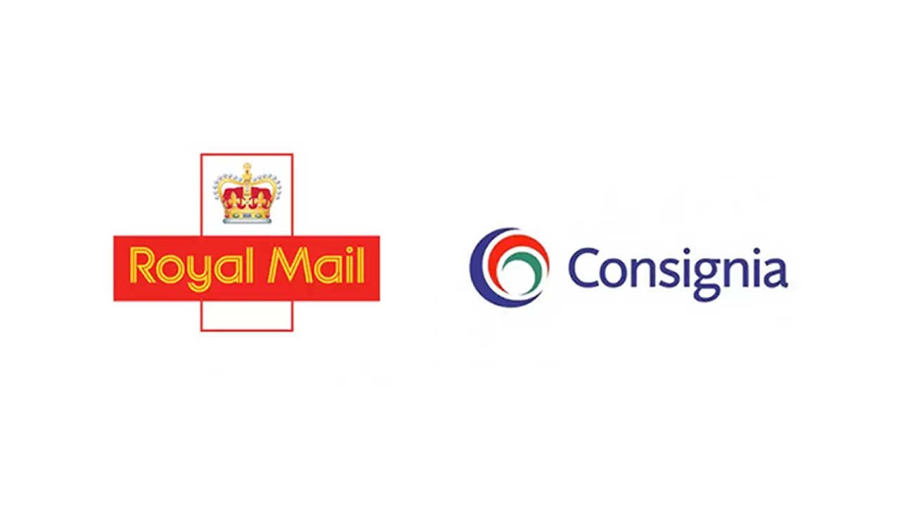
In 2001, the widely respected Royal Mail decided to undergo a rebranding effort, emerging as "Consignia" with a new logo to match.
Despite the company's intentions to signal evolution and progress as they branched out from the UK , the move proved disastrous.
After centuries as Royal Mail, the sudden shift left many feeling disconnected and unimpressed.
The £1.5 million redesign failed to capture the prestige, history, and quality associated with the Royal Mail brand, leading to a swift reversal within a year.
The subsequent £1 million spent on reverting to the original logo served as a costly reminder of the perils of straying too far from established brand identity.
Conclusion: Learning from Mistakes
These cautionary tales of logo rebranding gone awry underscore the importance of understanding a brand's essence and respecting its legacy.
Whether through misguided attempts at modernization or hubristic departures from tradition, these companies learned the hard way that a logo is more than just a visual marker—it's the embodiment of a brand's identity in the hearts and minds of consumers.
As we move forward in the ever-evolving landscape of branding and design, let us remember the lessons of the past and strive for authenticity, coherence, and respect for legacy.
Looking to rebrand? Reach out here to discuss your brands direction.